Monitors
Monitors are blocks that show your graph's widgets: text, buttons, tables, terminals, and more. A monitor block grows automatically into a bigger screen when you place more monitors next to it.
Crafting and placing a monitor
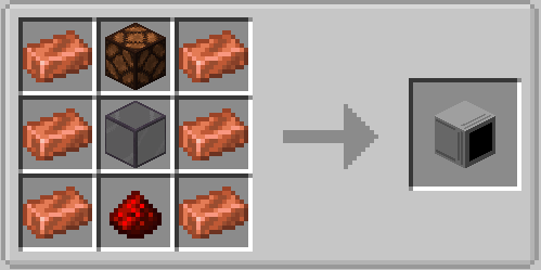
Where you look while placing decides the orientation: look straight ahead for a wall screen, look down for a floor screen, look up for a ceiling screen.
Growing the screen
Place another monitor block directly next to an existing screen (same orientation) and the two merge into one bigger screen, up to 8 blocks wide and 6 blocks high. Breaking a block of a bigger screen splits the rest into new screens.
Connecting a screen to a computer
Place the screen so it touches one side of the computer, then use a Monitor node in your graph.
Its Face field selects the side (front by default — set it to the side the screen is on).
The Monitor node collects up to 16 widgets through its widget_1 … widget_16 inputs and
sends them to the screen. Press + on the node to add an input, − to remove the last one.
Screen goes blank?
The computer must run a graph tick that feeds the Monitor node. If the graph stops (or the computer is removed), the screen clears after a moment.
Widget layout
Every widget node has a Layout field with two modes:
- line (default): the widget takes a full row. Line picks the row (1 = top), Span makes it taller (for example a table with span 4). If the chosen row is occupied, the widget moves to the next free row.
- manual: you set X, Y, Width, and Height in pixels yourself for free positioning.
A 1-block screen is 64×64 pixels (2 rows); the biggest 8×6 screen is 512×384 pixels (12 rows). Two widgets that end up on the same spot in line mode — the later one is dropped.
The widget types
| Widget node | Shows |
|---|---|
| Text Widget | One line of text |
| Number Widget | A right-aligned number |
| Clock Widget | Current time, optional seconds |
| Text Block | Multiple lines of text |
| Button | Clickable label (sends an event to the node) |
| Checkbox | Toggle (sends an event to the node) |
| Slider | Value between min and max |
| Number Input | Editable number (click opens a dialog) |
| Text Input | Editable text (click opens a dialog, up to 256 characters) |
| Progress Bar | Value as a bar |
| Panel | Background rectangle |
| Table | Header plus rows (up to 16 columns × 64 rows) |
| Terminal | Terminal area (64 lines × 256 characters) |
| Terminal Line | One styled terminal line |
Clicking widgets
Buttons, checkboxes, sliders, and text inputs react to clicks on the screen (within 16 blocks of the computer). Clicks are forwarded to the widget nodes as events — see Graph Events.
Portable screens
The Portable Monitor item shows the same widgets on a handheld 16:9 screen without placing any monitor blocks.